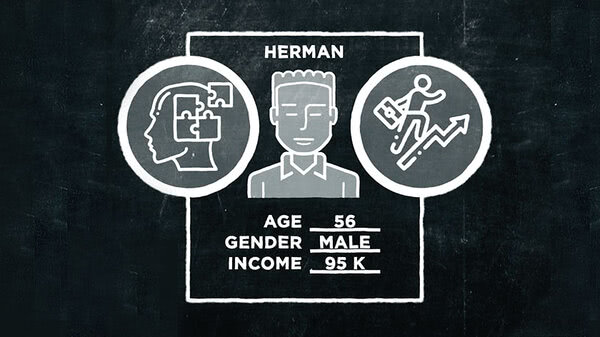
This series of videos is all about designing for mobile devices and the people who use them. Which, if you hadn't heard, hit the tipping point sometime in November 2017.
That's when more people visited websites using phones and tablets than on desktops or laptop computers. Even before that, several web pundits were warning of Mobilegeddon. This was their word for what was happening due to Google's new search algorithm. It boosted search rankings for websites that had been optimized for mobile devices.
Today, if you're not designing your site with an eye to the smartphone, you're very likely alienating the bulk of your visitors. That is if they can even find you. So, what should you do to attract mobile users to your site and keep them happy?
We're often told that mobile users are on the go rushing to some destination. They're more task oriented than desktop users. They've got a specific question to ask or a purchase to make. They want in and out of a site quickly. But is all of that true?
What about the teenagers sitting at the bus stop, head bent to their iPhone? Are they on a mission? Sure, they're a mobile user and yes, clearly they have a destination. After all, they're waiting for a bus. But are they checking to see when it arrives? Or are they just killing time on Instagram until then? It's hard to know, but to say someone is task oriented just because they're using a smartphone might be jumping to the wrong conclusion.
So what can we say about someone visiting your site from a mobile device and how do we give them the most satisfying experience? In this series of videos, we'll try to answer those questions. In addition, we'll be covering responsive design, effective layout, and element choices for the small screen, as well as understanding the mindset of the mobile user.
So let's get going.


